The not-so-random case of nonrandom randomness
Customer satisfaction data resulting in various quality indexes abound. The airline industry is particularly watched. The April 10 Quality Digest Daily had an article with the title “Study: Airline Performance Improves” and the subtitle “Better on-time performance, baggage handling, and customer complaints.”
The analysis method? In essence, a bunch of professors pored over some tables of data and concluded that some numbers were bigger than others…and gave profound explanations for the (alleged) differences. If I’m not mistaken, W. Edwards Deming called this “tampering:” They treated all differences (variation) as special cause.
How much information like this gets published and how much of this type of (alleged) “analysis” are we subjected to in meeting after meeting…everyday?
“Released during a news conference at the National Press Club, the rankings show that of the 17 carriers rated in 2008 and 2009, all but Alaska Airlines had improved AQR scores for 2009.”
So, given 17 carriers, 16 had numbers bigger than last year. It sounds pretty impressive.
However, there is a deeper question: Is the process that produced the 2009 number different from the process that produced the 2008 number? Was there a formal method in place for improvement or was it just exhortation to “get better?” To paraphrase one saying of Joseph Juran’s, “There is no such thing as ‘improvement in general.'” And to paraphrase two saying of Deming’s, “A goal without a method is nonsense!” and “Statistics on the number of accidents does not improve the number of accident occurrences.” In other words, statistics on performance don’t improve performance.
So was it just a matter of work harder, work smarter?
Actually, in defense of the intuitive conclusion that things had indeed gotten better, statistics can be applied to this situation: Using the simple nonparametric technique called the Sign Test, given 17 pairs of numbers, the p-value of 16 out of 17 paired numbers being bigger just due to chance is 0.0003. In other words, based on this data, there is a 0.03 percent chance of being wrong making this statement, which is a pretty small chance.
Now, if 13 out of the 17 had gotten better, would you intuitively feel that things had improved? Probably. The p-value for that is almost exactly 0.05 (5% risk). For 12 improvements, the p-value now is 0.14 (14% risk). Surprised? This conclusion with the original data was pretty obvious, but sometimes things that “seem” obvious aren’t…and you’re probably just as well, if not better off, using a Ouija board (Well…you are using a statistical Ouija board of sorts).
The article had a reference where I was able to track down each key indicator’s 24 monthly numbers of 2008-2009. So, I did a “seasonality” analysis (Model: Year-over-year analysis as well as a seasonality analysis trying to determine whether certain months—regardless of the year—had a statistical tendency to always be “high” or “low”). I used an appropriate regression model and found the significant terms (via subset selection).
I then did the traditional regression diagnostics. They all analyze the residuals—the actual data values minus the model’s predicted values. The residuals of any model contain all of the information one needs to assess the model. Three diagnostics are usually taught in any good regression course:
1) the residuals vs. predicted value plot (should look like a shotgun scatter—this one was reasonable)
2) a Normal plot of the residuals (should look like a straight line and you get a p-value—this passed)
3) some type of lack-of-fit test to see whether the model is a reasonable one. This last test is based on having repeated x-values, which wasn’t the case here; however, many packages contain a proxy test using clusters of near neighbors as an approximation.
However, with process-oriented statistics, there is one additional diagnostic, which tends not to be taught in regression courses: I also plotted a run chart (time ordered plot with the median of the data drawn in as a reference) of the residuals, which should exhibit random behavior. This can help to find additional special causes due to interventions made at various times, which would invalidate the model as described above even if it passed all three of those diagnostics. Special causes require a model adjustment via dummy variables, which then requires a new subset selection with retesting of diagnostics.
When a reasonable model was found, I then used the model’s predicted values as the centerline of a control chart plot of the data.
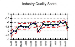
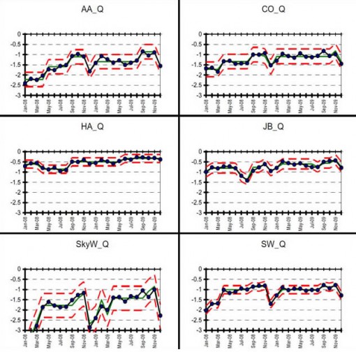
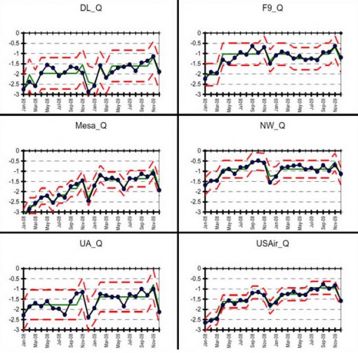
The figure below shows the overall quality index as well as the individual plots for 14 of the airlines (Of the original airlines analyzed, I left American Eagle, Atlantic South East, and Comair out of the this and subsequent analyses. These were small regional airlines and there were issues with missing data and wide variation that would have clouded discussion of the major points of this article).
Oh, so how did they determine that the 2009 number was greater than the 2008 number? In other words, how were the 2008 number and 2009 numbers literally calculated (operational definition)? My best guess is that it was just comparing one 12-month average to another…and concluding that any difference was a special cause.
(click on any image to enlarge)
If one sees a distinct “shift” upward in the 2009 data vis-à-vis the 2008 data, that’s statistical evidence that the 2009 result was higher than the 2008 result. This appears in the overall score. One can also see the distinct drop for Alaska Airlines (AS). However, due to special causes for which the model was adjusted, the alleged increases for F9 (Frontier), NW (Northwest), SW (Southwest) aren’t necessarily “real” (consistent?), given the data. So, out of these 14 airlines, 10 got better, one got worse, and three stayed the same. Applying the Sign Test: p = 0.0117, still a good indicator of “overall” improvement. But, then again, what does “overall improvement” mean? The aggregation of all scores into an overall indicator is like saying, “If I stick my right foot in a bucket of boiling water and my left foot in a bucket of ice water, on the average, I’m pretty comfortable.” I don’t fly an “average” airline, I fly a specific airline.
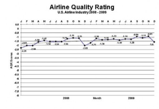
So, I’m curious. Are you intrigued by this presentation? Oh, and, by the way, in the data report cited in the article, this is all presented (overall and for each airline) in individual line graphs, with a trend line automatically drawn in because things should “somehow” be getting better (I wonder if they tested this “model” with the four diagnostics I used. I doubt it.)
Computer packages just love to delight their customers—who want to be able to draw in trend lines willy-nilly. The packages are only too happy to oblige! Ask about “diagnostics” and you’ll get met with blank stares—from the people using the package and the people who wrote the package. And that’s not all.
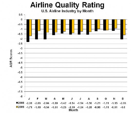
The overall and individual airlines each had their own bar graph as well. The horizontal axis was “month” and the two years’ results for each month were side-by-side bars. Here they are for the overall quality metric:
(click on any image to enlarge)
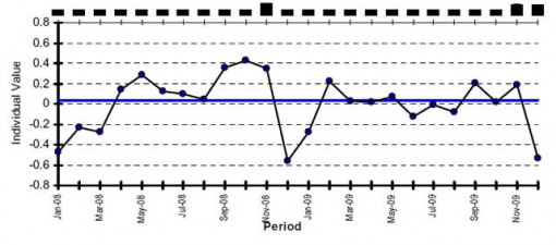
In fairness, the model was statistically significant (Of course it was: You’re fitting, in essence, the “two” different points of 2008 and 2009!). This “trend” model also passed the three basic diagnostics—the residuals vs. predicted value plot looked reasonable, the residuals were normally distributed, and, even though there weren’t any true repeated points, a proxy test didn’t declare the possibility that the model could be wrong. BUT…the last, rarely taught, diagnostic—a run chart of the residuals plotted in their time order—makes the alleged trend’s house of cards come crashing down:
(click on image to enlarge)
As previously mentioned, the residuals of any model contain all of the information you need to assess your model. And, in this case, this plot tells several stories. Notice the eight-in-a-row (observations 4-11) all above the median in 2008. Notice also that the January and December residuals (Observations 1, 12, 13, and 24) for both years are consistently low—indicating seasonality.
As the saying attributed to George Box (or maybe it was Deming) goes, “All models are wrong. Some, however, are quite useful.” My seasonality model passed all four diagnostics and you can even see the seasonality of the January and December observations.
They say “never say never,” but I am about to make an exception: In my 30 years as a statistician, I have never seen an appropriate use of a trend line on sets of data like this…never. If I had my way, trend lines would be banished from every management statistical package.
And, speaking of “trend,” here is another similar conclusion:
“For the second consecutive year, the performance of the nation’s leading carriers improved, according to the 20th annual national Airline Quality Rating (AQR). It was the third best overall score in the 19 years researchers have tracked the performance of airlines.”
Think about it: Given three (different) numbers, there are six possible combinations, two of which we would call “trend”—all going up or all going down. See www.qualitydigest.com/feb05/departments/spc_guide.shtml.
So, the odds of all three data points denoting a “trend” going up or down is two out of six or 0.33. It might be nicer to have a time series plot of all 19 numbers or at least a context of variation for interpreting the three numbers. I know, I know…I can hear some of you saying, “Well, a lot has changed over 19 years, so the plot might not be valid.” OK…so why compare the current number to the previous 18 then—the same issues apply, don’t they? And, isn’t it amazing: Given 19 numbers, one is indeed the third highest.
Let’s move on.
“The industry improved in three of the four major elements of the AQR: on-time performance, baggage handling, and customer complaints. Denied boarding is the only element where the performance declined.”
Yes, indeed, and, once again, as the title of this article implies, given two numbers, one will be larger. And, yes, as you will see, I agree with this conclusion. But, I think my theory and analysis is slightly more solid than just noticing that two numbers are different, then jumping directly to a conclusion.
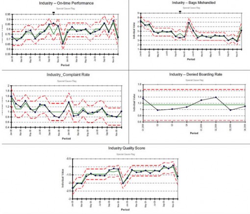
I performed the seasonality model and diagnostics as previously described. Here are the results for the overall industry data for the four indicators data aggregated for all airlines listed above (Denied Boarding was collected quarterly—eight data points vs. 24 for the others). So, which do you prefer and which gives you more confidence: A lucky guess with pretty graphs or an analysis based in theory?
(click on image to enlarge)
And then there is what some people consider the “bottom line”—the ultimate rankings: “Given a set of numbers, one will be the biggest…one will be the smallest…25 percent will be the top quartile…and 25 percent will be the bottom quartile.” But that’s a whole other article.
My point here is that it’s amazing how nonrandom randomness can look—and those bar graphs and trend lines are quite pretty aren’t they? And you are then at the mercy of the human variation in perception of the people in the room. How many meetings do you sit in with data presented this way? It reminds me of a quote I heard once, “When I die, let it be in a meeting. The transition from life to death will be barely perceptible.”
That’s why one should always begin by plotting the data in its naturally occurring time order, ask questions, and proceed cautiously to resist temptation to explain any (alleged) differences.


