As time goes on, I have an increasing affection for the much-neglected run chart
Any article about control charts leads to inevitable (and torturous) discussions of special cause tests—all nine of them. No wonder confused people continue to use things like trend lines. But I’m getting ahead of myself.
First of all, before you take another tools seminar or read another book—except, perhaps, Brian Joiner’s Fourth Generation Management (McGraw-Hill, 1994)—please try Dr. Donald Berwick’s admonition at the end of my Aug. 2, 2011, article, “A New Conversation for Quality Management”: Find something important, and plot it over time. This is probably the best way to learn the most important lesson of quality improvement: That everything is a process, and effective improvement means having new conversations around the crucial distinction between common and special causes. As I have relentlessly tried to make clear, you are swimming in everyday opportunity.
Most of my articles are concerned with statistical thinking in the context of an overall improvement process. This is much different from control charting, say, a machine on the manufacturing floor, which could indeed show a trend as in the classic case of tool wear. I’m sure there are others, but once again, that’s an application for the 1 to 2 percent of people who need advanced statistics. I’m trying to counteract the effects of Rule No. 4 of Deming’s Funnel Experiment, as it has manifested in the process of statistical training for the masses.
Treating every special-cause signal as… a special cause?
Many people have the misconception that each special-cause signal on a chart must be treated as a “special” cause—i.e., needs to be uniquely investigated. Have you ever thought, “Might there be one underlying explanation generating all of these signals?”
How ironic that a lot of people teaching control charts as a tool don’t understand this more subtle manifestation of common vs. special cause. As I continually emphasize, quality improvement is a mind-set that knows how to ask the right questions.
“But the test for trend is statistically significant…”
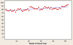
Someone once presented me with the graph in figure 1. (Yes, the y-scale started at zero.) It almost convinces you there is a trend, eh? (p-value < 0.001.)
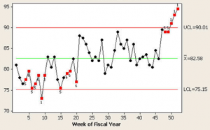
Some of you could be wondering, “What insight might a control chart give?” Figure 2 shows you, with the resulting tests for special causes:
Test 1: One point more than 3.00 standard deviations from center line.
Test failed at points 9, 50, 51, 52.
Test 2: Nine points in a row on same side of center line.
Test failed at points 9, 1.
Test 5: Two out of 3 points more than 2 standard deviations from center line (on one side of CL).
Test failed at points 4, 6, 7, 9, 15, 48, 49, 50, 51, 52.
Test 6: Four out of 5 points more than 1 standard deviation from center line (on one side of CL).
Test failed at points 5, 6, 7, 8, 9, 10, 17, 18, 20, 50, 51, 52.
Test 8: Eight points in a row more than 1 standard deviation from center line (above and below CL).
Test failed at points 9, 10.
Yikes! Sixteen of the 52 data points generate special-cause signals. Some data points even generate multiple signals. That’s 30 special-cause signals total. Where does one begin?
Unfortunately, the way I see control charts generally taught, “obviously” one should initially investigate, individually, the four points outside the three standard deviation limits, in this case observations points 9 and 50–52… not!
As time goes on, I have developed an increasing affection for the much-neglected run chart, a time plot of your process data with the median drawn in as a reference line. It is filter No. 1 for any process data, and it answers the question, “Did this process possibly have at least one shift during this time period?” This is generally signaled by:
- A clump of eight consecutive points either all above or below the median
- Less often, six consecutive increases or decreases. This is sometimes called a “trend” but more correctly, it indicates a transition to a new process level. (Any good software package should do this analysis and let you effortlessly toggle between run charts and control charts.)
Here’s the rationale for using the median: If special causes are observed in the run chart, then it makes no sense to do a control chart at this time because the average of all these data doesn’t exist. Sort of like, “If I put my right foot in a bucket of boiling water and my left foot in a bucket of ice water, on average I’m pretty comfortable.”
One of the healthiest things that a run chart can do is get you thinking in terms of “process needle(s),” i.e., focusing on the process’s central tendency.
Most of the time, run charts are glossed over and taught as the boring prerequisite to learning control charts. Isn’t it far more exciting to jump right to the control chart with all its bells and whistles, look at the special-cause signals, and try to find reasons for each individual signal?
The run chart does not find individual special-cause observations because that is not its purpose. That is one of the objectives of the control chart—call it filter No. 2. One plots the data incorporating the shifts detected via the run chart. This usually reduces the number of subsequent special-cause signals, resulting in a lot less confusion. The control chart also has an additional power to detect more subtle shifts neither obvious nor detectable in the run chart.
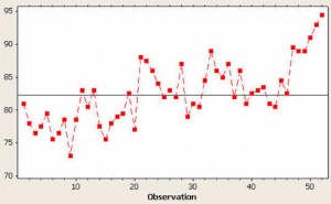
So, what light might a run chart shed on the current situation? Take a look at figure 3:
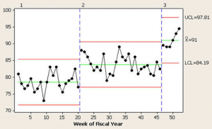
With the y-axis scale a lot healthier and no control limits as a distraction, doesn’t it look like the “needle” shifted twice—around observation points 21 and 47? In fact, when I asked the clients about those two particular points and their corresponding dates, they looked at me like I was a magician and asked, “How did you know?” Those dates coincided with two major interventions to improve this process.
As the chart in figure 4 shows, they worked—two needle bumps—not a continuously increasing improvement “trend.” Making only those two adjustments, the correct resulting control chart is shown below. There’s not a special cause to be found, but there is a possible improvement/transition in the making, as evidenced by the last four data points. Time will tell.
Take “the challenge”
1. Can you think of one or two applications like this in your everyday work or meetings? Plot it.
2. Can I also challenge you to take one routinely “trended” data display and plot it as a run chart?
3. Will you promise me that, before you take yet another course on more tools, you will do a (mere) run chart of a number that makes you sweat?
4. What part of “never”…. If someone asks you to “trend” some data, will you flat out refuse? If so, be prepared: You probably will also have to refuse his valiant attempt to keep the trend monster alive via the dreaded “two-headed transplant” technique—i.e., when he predictably insists, “OK, then, just put them both on the same page.”
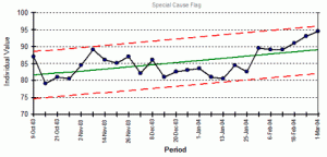
5. And beware of this monster’s cousin (figure 5):
P-value for trend: < 0.001, R-squared: 51.1 percent—and total rubbish!
A final clarification
For those of you who may still be slightly confused, ponder this: Suppose you’re trying to lose weight. You make a hefty cut in your calories. You start weighing yourself every day and plot it. During the first two weeks, you will probably lose 5 to 7 pounds of “water weight.” For the next two weeks, you will probably lose 1 to 1 1/2 pounds a week. After that, physiologically, the body adjusts to your decreased caloric intake to the weight that it is “perfectly designed to get” and levels off. Then, by all means, go ahead and fit a trend line; I guarantee a statistically significant regression. And if your weight loss proceeds perfectly linearly according to the line, please let me know—the day before your weight goes to zero.
For purposes of improvement: trend = transition to the new process you are “perfectly designed to get,” given your new inputs vis-à-vis your old status quo.
